Turning painful feedback into success
About a week ago, I attended a meetup for startup founders and chatted with a guy who was clearly having great success with his company. He and his co-founder had failed with an earlier idea, but in the last few months, they came up with something that was starting to bring in a few thousand dollars each month.
When it’s my turn to share, I mentioned by latest app, Card Buddy, and how I had just released it on iOS a few days prior. I worked incredibly hard on this release, so I was quite proud of the app.
Mr. Successful Startup Guy downloads the app and launches it as I watch… Immediately, he’s confused. Upon launch, the app drops him into an empty folder with just a “Create Document” button. No welcome screen or explanation of the app can do.
Naturally, he he taps the button to create a new document… and is met with a paywall. 🤦♂️
Oops. Not a great experience for a new user.
I apologize and mention how the UI component I used was provided by iOS and I didn’t have any control over which folder you started out in. I tell him that the app does have some sample documents he can take a look at. He just has to navigate to the right folder.
He tries finding the samples, but he couldn’t figure out where he was in the browser. 🤷♂️ Apparently, the file browser had dumped him into a random iCloud folder and not a folder related to the app at all.
It was at this point that he starts giving some pretty harsh feedback about how “Nobody is going to understand this!” and “What am I supposed to do here?!” It was pretty embarassing. He basically gave up on the app at that point, putting his phone back in his pocket, shaking his head.
Imagine pouring your heart and soul into an app and then somebody telling you it’s confusing and that nobody is going to get it. I wasn’t devastated, but I definitely felt bad. It’s all I could think about the rest of the meetup.
Now what?
The thing is, his feedback was absolutely correct. That’s why it hurt more. After all that work I had put in to get that first iOS release out the door, I missed a pretty major issue. This is an issue that is literally going to prevent people from progressing in the app, meaning I would be losing potential sales.
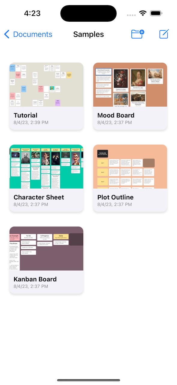
I took the feedback to heart. The next three days, I worked my ass off to make that new user experience really polished. I ended up ditching that ugly file browser UI and built my own UI from scratch just so that I could ensure the user was dropped into the Samples folder.
I added a preview image to the samples as well to make it even clearer what you were getting even before you tapped on anything.
I got rid of that awful paywall, too. On top of that, I created more sample documents to really show off features of the app. There was no way new users would be confused by this new UI.
Here’s how it looks now:

The Aftermath
A couple days after that encounter with Mr. Harsh Feedback Guy, I got a DM from somebody else who tried the app, saying they couldn’t figure out what to do after launching it. So, confirmation from a second person––an actual potential customer this time!––that the app was confusing.
I finished the necessary updates and released a new version of the app to the App Store, just shy of a week after that initial encounter. And guess what? I immediately saw an increase in purchases on iOS! Even the guy who DM’ed me with his feedback contacted me again to tell me that the new UI really helped.
In the end, that harsh feedback turned out to be a blessing. I’ll admit my ego took a hit when somebody trashed the app, but I didn’t get down on myself. I just asked, “How can I make this better?” and then took decisive action to fix it.
If you want to learn more about how feedback can make a difference, there was a really good episode of Hidden Brain that covers just this topic. It’s worth a listen!
Do give Card Buddy a try, and be sure to send me any feedback you may have. 😉